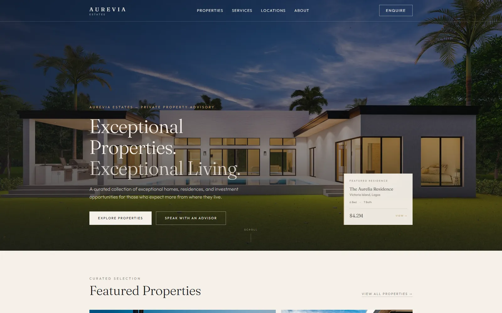
This one is our own design idea rather than client work. We created it to show how we would approach this kind of business. It was not commissioned by anyone, and we are not claiming any results from it.
Luxury Real Estate · Premium Digital Experience
Project type: Self-initiated design exploration Project status: Showcase project
Overview
Aurevia Estates explores how a luxury real-estate advisory brand could translate the emotional appeal of premium property into a digital experience without looking like a conventional property-listing portal.
The concept is deliberately editorial, restrained and image-led, with the property treated as the hero of the experience.
The brief
Design a premium digital experience that can:
- Establish Aurevia as a high-end property advisory brand.
- Make featured properties visually desirable.
- Provide meaningful property information without creating a marketplace feel.
- Communicate advisory services.
- Introduce a sense of geographic reach.
- Move serious prospects toward a private enquiry.
Our approach
We built the journey around:
Discovery → Desire → Detail → Trust → Enquiry
Photography establishes aspiration first. Property information then provides substance. Service content introduces the advisory layer, and the enquiry experience offers a more personal next step.
Design decisions
Editorial rather than transactional
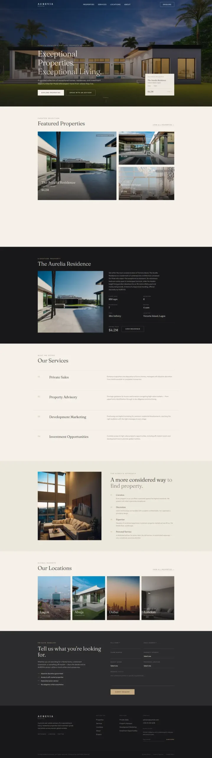
Instead of a traditional listing grid dominating the homepage, properties are arranged like an editorial collection.
Architecture-led imagery
The visual system gives large, cinematic photography enough space to create an emotional response before the visitor gets deep into details.
Quiet luxury
The palette uses warm neutrals, charcoal and restrained accents instead of excessive gold or decorative effects.
Typography as brand identity
An elegant serif-led headline system creates a more timeless, editorial character while supporting UI elements remain deliberately functional.
Featured residence treatment
The signature residence receives its own darker visual section. This gives the property a sense of importance and separates it from the collection above.
Private enquiry
The final conversion point asks visitors what they are looking for rather than using aggressive sales language.
Why we designed it this way
Luxury does not need more information. It needs better hierarchy.
The experience is designed to move the visitor naturally from:
“This looks exceptional.”
to:
“I understand what I’m looking at.”
to:
“I want to know more.”
What this project demonstrates
Aurevia demonstrates Fortsrex’s ability to combine art direction, typography, brand positioning, property storytelling and conversion thinking.
Outcome
This is a self-initiated project and therefore has no client sales, enquiry or revenue metrics attached to it.
The value of the project is the thinking behind the experience and the level of visual execution.
The full page
Want something like this for your business?
Tell us what you need and we’ll come back with a plan, a timeline and a price.