Logo & Visual Identity · Natural Products
Project type: Brand identity concept Services: Logo design · Visual direction
Overview
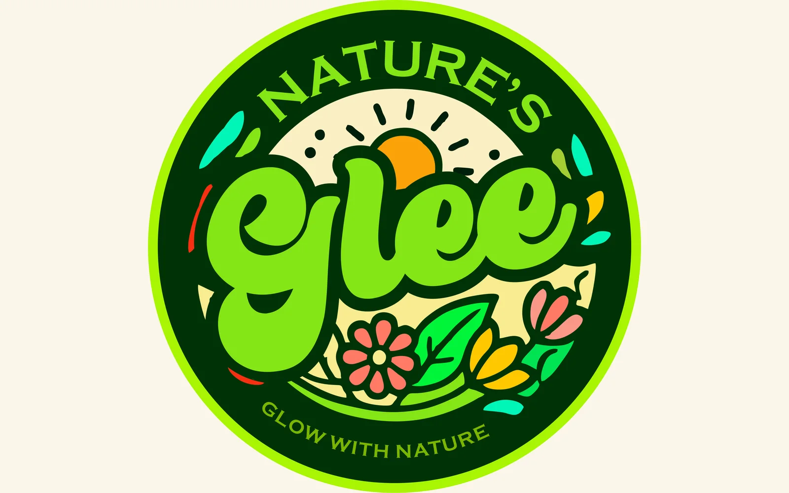
Nature’s Glee is a natural-product brand identity exploration built around an energetic relationship between nature, growth and everyday wellbeing.
The challenge was to create a mark that felt organic without becoming predictable, while remaining distinctive enough to work as a standalone brand symbol.
The brief
Create an identity that can:
- Communicate a clear connection to nature.
- Feel fresh, energetic and approachable.
- Avoid generic leaf-only branding.
- Work across packaging, social media and product applications.
- Remain recognisable as a compact emblem.
Our approach
The visual direction combines a circular emblem with an illustrated natural scene.
The mark brings together:
Plant life + sunlight + colour + growth
to create a more expressive interpretation of the brand name.
Design decisions
Emblem-based identity
The circular structure gives Nature’s Glee the feel of a complete badge, helping it work well on labels, packaging, profile images and promotional material.
Organic illustration
Leaves, flowers and landscape elements create the connection to nature without depending on a single symbolic leaf.
Vibrant natural palette
The use of green, yellow, orange and complementary organic tones creates a lively character rather than the muted aesthetic often associated with natural-product brands.
Strong name integration
The brand name is integrated directly into the emblem so the identity remains identifiable even when viewed without additional supporting copy.
Why we designed it this way
The objective was to make “natural” feel alive, not clinical or overly minimal.
The identity therefore uses illustration, colour and a badge structure to create warmth and recognisability.
What this project demonstrates
Nature’s Glee demonstrates Fortsrex’s ability to develop an identity from conceptual visual language, especially where a brand needs to communicate nature, energy and approachability.
Outcome
This is a logo and visual-identity exploration. No commercial performance claims are attached to the design.
Want something like this for your business?
Tell us what you need and we’ll come back with a plan, a timeline and a price.