National Youth Congress 2026
Event campaign graphics that turn a dense speaker and programme announcement into a clear, structured visual system.
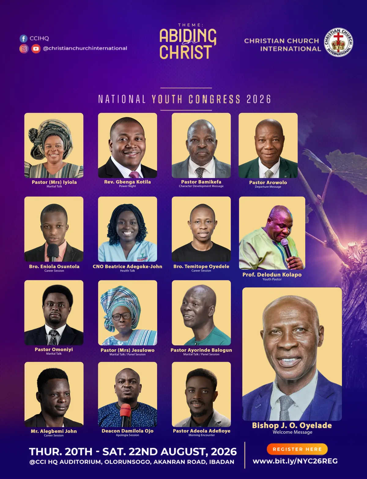
Event Campaign · Social Graphics · Information Design
Project type: Event communication design Services: Campaign art direction · Layout design · Information hierarchy · Social graphics
Overview
The National Youth Congress 2026 campaign required promotional graphics capable of communicating a large amount of event information without losing visual energy.
The materials included event identity, theme, speakers, session responsibilities, dates, venue and registration information.
The brief
Create event campaign graphics that can:
- Establish the event and theme immediately.
- Present a large number of speakers clearly.
- Associate each speaker with their session or role.
- Maintain visual hierarchy across dense information.
- Include dates, venue and registration details prominently.
- Remain consistent across multiple campaign graphics.
Our approach
We treated the graphics as a campaign system rather than isolated flyers.
The primary composition establishes the event identity first, then organises speakers into a repeatable card structure.
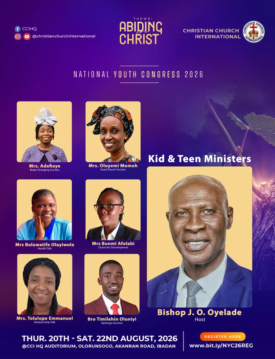
A separate graphic was created for the additional speaker group so the campaign could expand without abandoning the visual language established in the main artwork.
Design decisions
Strong thematic header
The event theme, “Abiding in Christ,” receives prominent placement at the top so the audience understands the campaign context immediately.
Speaker-card system
Each speaker receives a consistent visual frame, name treatment and role/session label.
This creates order even when the speaker images vary in pose, clothing and photographic quality.
Visual hierarchy
The host/welcome-message speaker is given a larger treatment, creating a clear hierarchy between the featured figure and the wider speaker lineup.
Background treatment
The purple-to-blue environment, texture and subtle organic imagery create a recognisable campaign backdrop without competing with the speaker portraits.
High-visibility registration CTA
Date, venue and registration information are concentrated near the bottom so the audience can move quickly from awareness to action.
Why we designed it this way
Event graphics often fail when too much information is treated with equal visual weight.
The design instead establishes a clear hierarchy:
Event → Theme → People → Roles → Date → Venue → Registration
That makes a dense announcement easier to scan while preserving the sense of occasion.
What this project demonstrates
The campaign demonstrates Fortsrex’s ability to handle information-heavy visual communication, especially where multiple people, roles and event details have to coexist within one coherent visual system.
Outcome
The project is presented as campaign design work. No attendance or registration results are claimed without verified reporting.
Selected screens
Want something like this for your business?
Tell us what you need and we’ll come back with a plan, a timeline and a price.